Interactive Design | Exercise 2
01/04/2025 - 08/05/2025 | Week 2 - Week 3
Jesslyn Octavia Tjong / 0374562 / Bachelor of Design (Honors) in Creative
Media
Interactive Design / Taylor's University
INSTRUCTION
EXERCISE 2: WEB REPLICATION
This exercise involves recreating two main pages from websites
previously analyzed/ within the website award linking to better grasp
their structural design. Pay close attention to replicating the
original dimensions, layout, typography, and color scheme using
software like Photoshop or Illustrator. We can use similar stock
images and fonts from resources like Google Fonts, referencing the
original pages via screenshots. Finally, document the process in
e-portfolio, and upload the source files to a public Google Drive
link.
In this exercise, we would be replicating OH Architecture and
Tripletta.
This is a website that I previously chose in Exercise 1.
Figure 1.1 "OH ARCHITECTURE's Home Page"
This is the main page I captured in its entirety using the
browser's developer tools. I right-clicked, selected "Inspect,"
accessed the "three little dots" menu, and chose "Capture
full-size screenshot," resulting in the image below.
Figure 1.2"OH ARCHITECTURE's Full-Size Screenshot Home Page"
REPLICATION PROCESS :
1. Establishing Grids and Rulers:
The very first step involved setting up a precise grid system and utilizing
rulers within the design software. This was crucial for accurately mapping
out the website's dimensions, including both width and height, and
understanding its overall layout structure. The initial observation
highlighted OH Architecture's significant use of white space and the
presence of large images with diverse size variations, which informed the
grid setup.
2. Identifying a Comparable Font:
To replicate the website's typography, I explored Google Fonts and
identified
DM Sans
as a highly similar sans-serif typeface. While a subtle difference in
kerning (the spacing between individual letters) might be noticeable upon
close examination, DM Sans provides a very close visual match to the
original font.
Figure 1.3"OH ARCHITECTURE's Replica Font"
3. Image Selection:
Finding suitable images involved searching on Pinterest using relevant
keywords such as "house exterior" and "house exterior with people." The
goal was to find visuals that aligned thematically with the architectural
content. Once sourced, I focused on color-matching these images as closely
as possible to the original website's photography. Resizing the images was
done proportionally by holding the Shift key while dragging a corner
handle to maintain their aspect ratio.
Figure 1.4"OH ARCHITECTURE's Images with the Right Rulers "
Captioning and Text:
The final stage involved adding all the necessary captions and other
textual elements present on the original OH Architecture website pages.
This included replicating the font styles (using DM Sans), sizes ( using
SemiBold, Bold, or Medium for the captions ), and positioning of all the
wording to complete the visual and informational parity of the replicated
pages.
FINAL RESULTS :
Figure 1.5"OH ARCHITECTURE's Full-Size Screenshot Home Page"
Reflection :
Replicating the OH Architecture website underscored the significance of a robust structural foundation in web design. The emphasis on grids and white space highlighted their role in creating openness and sophistication. Font selection, such as DM Sans, further illustrated how subtle typographic choices impact the overall aesthetic. This project reinforced the importance of discerning and applying design principles in website replication.
Figure 2.1 "Tripletta Pizza's Full-Size Screenshot Home Page"
I selected this website primarily due to its lack of video elements despite its visible movement in transitions,
simplifying the capture process and allowing for a clearer understanding of
a concise and straightforward restaurant website focused on appealing food
like pizza. The website changes the color scheme as it scrolls down in which my case Tripletta Pizza follows a green color scheme.
Figure 2.2"Tripletta Pizza's Full-Size Screenshot Home Page"
1. Structuring with Grids and Color Zones:
My initial step involved implementing grids and rulers to understand the
website's layout. Identifying sections is the reason I placed rules and
grid tso I could accurately represent the different color areas present on
the page.
Figure 2.3 "Grid and Rulers in Tripletta Pizza"
2. Typography - Matching Oswald:
For the font, I found Oswald to be a strong match, particularly in its
letter spacing and the overall dimensions of each character. I immediately
started creating the titles to clearly differentiate the different
sections of the website.
Figure 2.4 Playing with Sizes in Tripletta Pizza"
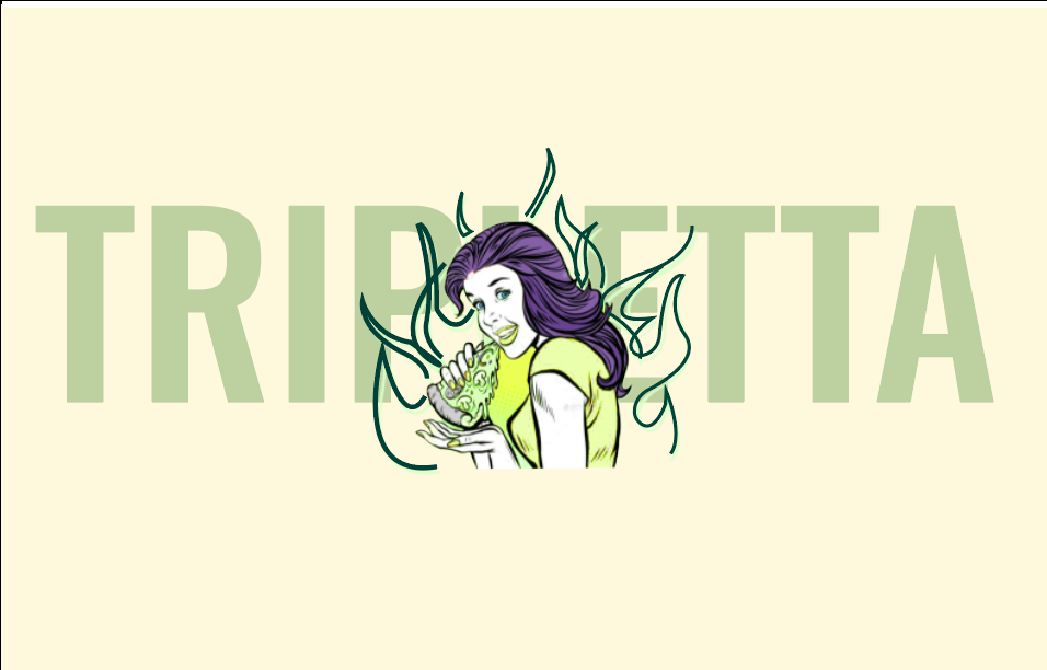
3. Focus on Logo and Element Recreation:
This website had minimal pictures compared to the first, which made it
easier to locate the limited number of images for this website, as it was
straightforward. My primary visual focus shifted to meticulously
recreating the logos and other design elements using tools like Photoshop
and Illustrator to ensure visual appeal and authenticity. This included
tasks such as color-matching backgrounds and using the pen tool to
reconstruct the girl with the fire logo, as well as recreating the pizza
visuals.
Figure 2.5 "My Own Version of Tripletta Pizza's Girl Logo"
4. Final Text Placement:
The concluding step involved the precise placement of all captions, other
textual information.
FINAL RESULTS :
Figure 2.6 "Tripletta Pizza's Final Replication"
Reflection :
The Tripletta Pizza website presented distinct challenges, particularly in visual element creation. Recreating logos and design components in Photoshop and Illustrator emphasized the necessity of digital image manipulation skills. This process highlighted the effort involved in establishing a cohesive brand identity. The replication exercise underscored the importance of meticulous attention to detail in capturing a website's essence.
Conclusion :
Replicating the OH Architecture and Tripletta Pizza websites gave me some valuable insights into the different things you need to think about in web design. The OH Architecture project really emphasized how important structural integrity and typography are, while the Tripletta Pizza project highlighted the complexities of creating visual elements and capturing a brand's identity. Both exercises showed me that website replication requires a really nuanced approach, where attention to detail and a solid understanding of design principles are key.


Comments
Post a Comment