Interactive Design | Exercise 1
Interactive Design | Task 1
21/04/2025 - 5/05/2025 | Week 1 - Week 3
Jesslyn Octavia Tjong / 0374562 / Bachelor of Design (Honors) in Creative Media
Interactive Design / Taylor's University
I. LECTURES
II. INSTRUCTIONS
I. LECTURE
Week 1 ( 24/2/25 )
Week 2 ( 02/05/25)
II. INSTRUCTION
MIB April 2025
EXERCISE 1: WEBSITE ANALYSIS
In this exercise, five websites from the provided links of website nominees are selected to be reviewed through a focused analysis of design, layout, content, and functionality choices on strengths and weaknesses in respective areas. This would pinpoint their impact on user experience, which will be written through the report summaries below.
1. EISLAB
EISLAB'S PURPOSE & GOAL
Eislab aims to gain and keep customers who value high-quality ice cream by building a strong brand known for delicious, potentially unique flavors. They intend to clearly share their brand values and products through their website and other marketing. This site offers an English translation alternative, which I will analyze through this translation.
Figure 1.1.1 "Home Page of Eislab"
DESIGN :
EISLABb's home page uses its first page with the primary colors in order to gain attention. It then continues to use friendly, rounded (sans-serif) fonts for easy reading, especially when it comes to hierarchy. Their color palette features pastels and vibrant shades, directly mirroring their diverse and appealing gelato flavors. EISLAB's subtle use of circles in design elements likely contributes to a feeling of softness, approachability, and visual harmony, subtly mirroring the enjoyable experience of their ice cream.
LAYOUT:
EISLAB's layout prioritizes visual appeal and ease of navigation. The clean design with a white background and vibrant colors highlights the sections with ease and the simple structure makes it easy for users to find information about their ice cream. It follows common page structure patterns, which contributes to its usability and promotion of their product.
Figure 1.1.2 "EISLAB's About Page"
EISLAB's content aims to showcase their "premium ice cream brand" by emphasizing quality and highlighting their passion for delicious ice cream. This is relevant as the descriptions and images showcase the variety and the quality of their offerings. The "About Us" section provides context about the brand (though limited), which is relevant for customers wanting to know more than just the product itself. By focusing on their passion for gelato and their location, the content aims to connect with potential local customers and those interested in a brand with a dedicated focus.
FUNCTIONALITY :
EISLAB's website demonstrates good usability with quick load times and responsive interactive elements that enhance browsing without disrupting information flow. Navigation is straightforward. However, the placement of location details at the end decreases usability for those seeking it quickly, and the absence of a clear online delivery option is a significant functional drawback for potential customers.
2. T-CUP
T-CUP'S PURPOSE & GOAL
T-CUP is a Ukrainian brand focusing on the F&B industry by introducing its tea product to be unique, having only one component instead of two components for a usual tea drink. This website offers both Ukrainian and English translations.
Figure 1.2.1 "T-CUP's Page"
DESIGN :
The website design prominently features the innovative T-Cup, emphasizing its unique form and functionality. There are not many other images reinforcing except the T-cup and its various colors of flavors, which tell users to have an informed decision when ordering. It mainly uses green, yellow, and blue color schemes to evoke feelings of nature, freshness, and harmony. The typography uses a decorative sans-serif font that is similar to the way the Ukrainian alphabet uses. This design choice aims to appeal to both a niche market of tea lovers and the broader drinks market.
LAYOUT:
The layout prioritizes product information. The T-Cup website uses a direct, single-page layout. A consistent header displays product details and language options. The main content flows sequentially, showcasing the T-Cup, its preparation, and flavors, navigated via scrolling and "Previous/Next" buttons. There's also a contact form and footer that reside at the bottom. This linear arrangement prioritizes a straightforward presentation of product information without extensive navigation to separate pages.
CONTENT :
The website's content focuses primarily on its tea offerings. Each tea has a dedicated page with details on flavor profiles, ingredients, and brewing instructions. This showcases the company's ability to be transparent and visible about their ingredients and incentives in creating a product like this to a niche market of tea lovers and a huge market for drinks. There's little to no information about the company except contact options to learn more.
FUNCTIONALITY :
The website, although quite short in comparison to most, primarily functions as an informational resource for the T-Cup product, detailing its preparation, flavors, and ingredients. Interactive elements, such as the T-cup itself, the "Previous" and "Next" buttons for flavor navigation, are quick and responsive. The site also features a readily available contact form for business inquiries. Performance seems good with quick load times and smooth transitions between sections. It effectively promotes the product, but there are no details or e-commerce details for customers.
OH ARCHITECTURE'S PURPOSE & GOAL
OH Architecture is an Australian architecture firm that uses its website to showcase expertise and portfolio to attract potential clients for their architectural services for both residential and commercial works in Australia.
Figure 1.3.1 "OH ARCHITECTURE's Home Page"
DESIGN :
OH Architecture's design illustrates a clean and minimalist aesthetic, generously using negative space to emphasize its high-quality architectural photography and create a sophisticated feel. A modern, legible sans-serif typography ensures clarity and reinforces their professional image. This deliberate use of space and typography of different sizes establishes a clear visual hierarchy, enhances readability, and conveys a sense of precision and high-end quality.
LAYOUT:
The layout is structured and organized. After the home page, it'll provide the company's goals of creating homes of people's dreams. Following the homepage, it articulates the company's goal of realizing clients' dream homes. The use of a grid-based layout helps organize the content effectively. The structure is intuitive, guiding visitors through their portfolio and services. At the end of the main page, it guides users through the informed process and timeline of how services would be done alongside a client review to build trust.
CONTENT :
OH Architecture's content showcases their dream home creation through high-quality project photos and concise descriptions. The "About" section details their approach, and testimonials build trust. Clear, professional language and a well-organized structure inform potential clients. The concluding process section provides practical information and transparency with potential clients throughout their consultation and other processes moving forward.
FUNCTIONALITY :
The website offers intuitive navigation, allowing easy browsing of their portfolio and the company's information. There are image galleries through the View More option to fully showcase project exploration and results. At the end of the page, a contact form is available to provide a direct communication channel. The site appears to perform well with quick loading times and good responsiveness.
4. Baci Baci Matera
BACI BACI MATERA'S PURPOSE & GOAL
Baci Baci Matera is an Italian website that promotes and sells their donkey milk cosmetics to those seeking natural skincare. This website raises brand awareness, educates on benefits, drives online sales, and builds customer loyalty. It offers both Italian and English websites to gain both local and international demographics.
Figure 1.4.1 "BACI BACI MATERA'S Home Page"
DESIGN :
Baci Baci Matera utilizes a vibrant color palette consistently across its range of cosmetic and personal hygiene products. The adoption of a script-like font aims to project sophistication and appeal to a feminine audience. A distinctive donkey logo is strategically employed to clearly communicate the origin of their key ingredient – donkey milk – and to suggest a natural manufacturing process. This visual branding works to immediately inform and attract their target demographic ( locally and internationally) while highlighting their unique selling proposition.
LAYOUT:
The website's layout prioritizes clear section identification through the use of large, prominent fonts. The clear navigation and structured product pages facilitate a smooth shopping experience. It aims for a quick and concise delivery of essential product details within each section. This website optimizes space and user experience by using a dedicated vertical scrolling section for its product catalog, rather than relying on long, image-heavy scrolling.
CONTENT :
The website's content unfolds sequentially on the homepage. Initially, four popular products are showcased to immediately grab attention. This is followed by a direct company message intended to connect with the audience. The next section lists a complete catalog of their products, requiring users to scroll through entirely before reaching information detailing the donkey milk source and the significance of Matera as the product's origin. Finally, the end of the website contains navigation links.
FUNCTIONALITY :
The website has smooth transitions between sections and ensures quick loading times, contributing to a positive user experience. Navigation links are conveniently placed both at the beginning of the content, allowing for immediate jumps to different areas, and at the end, providing a standard way to explore the site after reviewing the initial information. This dual placement aims to cater to different user browsing habits.
5. Orken
ORKEN'S PURPOSE & GOAL
Orken aims to introduce and build anticipation for the Orken fantasy project (novels, setting books) to engage potential readers and backers. This helps newcomers and older fans to continue its interest, build community, drive crowdfunding support, and secure readership.
DESIGN :
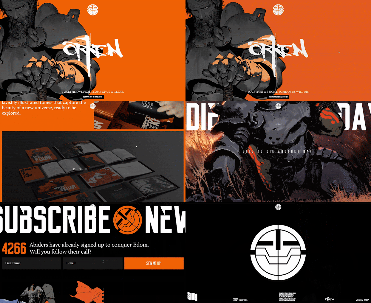
Orkenworld's design is heavily reliant on visually striking, "lavishly illustrated tomes," immediately establishing a strong artistic identity for the fantasy project. The overall aesthetic is clean and uncluttered yet intense through the use of orange color, ensuring the detailed artwork and world-building elements take center stage. A consistent color scheme and typography likely contribute to a cohesive and immersive experience. This focus on high-quality visuals aims to captivate the Orken universe and engage potential fans of contemporary fantasy.
LAYOUT:
The website employs a straightforward and intuitive layout. A clear and concise navigation menu at the top provides easy access to key sections such as "Home," "Teasers," "About," and "Kickstarter," allowing visitors to quickly explore different aspects of the project. The homepage is structured into distinct sections that progressively introduce the Orken intellectual property. This logical flow guides newcomers through the core concepts and encourages further exploration of the available teasers and background information. The layout prioritizes ease of understanding and navigation.
CONTENT :
The website's content serves as an introduction to Orken, positioning it as a contemporary fantasy project encompassing novels and setting books. It provides engaging "teasers" likely offering glimpses into the lore, characters, and narrative of the world of Edom. The "About" section offers a brief overview of this fictional world and its history, aiming to pique the reader's interest and establish the depth of the Orken universe. The content is designed to inform potential readers and backers about the project's scope and creative vision, building anticipation for its launch or crowdfunding campaign.
Figure 1.5.2 "ORKEN's Discord"
FUNCTIONALITY :
The primary functionality of the Orkenworld website is to serve as a central hub for information and community engagement. It strategically links to external platforms such as Kickstarter, indicating an upcoming or ongoing crowdfunding phase, as well as to YouTube for video content and Discord for community interaction. A prominent newsletter signup encourages visitors to stay informed about project updates. The inclusion of a "Bookmark Now on Kickstarter" button is great to continue engagement with their crowdfunding campaign, highlighting the website's role in building support and awareness.


.gif)


Comments
Post a Comment