TYPOGRAPHY | TASK 2
TYPOGRAPHY | TASK 2
1/11/24 - 17/11/24/ | Week 6 - Week 8
Task 2: Exercises
Table of Contents
I. LECTURE
II. INSTRUCTIONS
III. FEEDBACK
IV. REFLECTIONS
V. FURTHER READINGS
I. LECTURE
Refer to Task 1 Lectures
II. INSTRUCTIONS
Task 2 : Editorial Text
RESEARCH :
Reading through the text of text option #3, it remarks about the visual communication and what creativity can really do in a way. Using the title of the text "Unite to Visualise A Better World" offers me several ideas how to settle the heading through an eye-opening style of a progressive and modern font of "Futura", "Univers", and "Adobe Caslon".
IDEATION
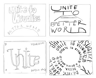
I promptly went to Procreate to create sketches of the designs I'm planning to digitize later on. Each style takes a different approach on how I'll emphasize "Unite" or "Visualise". These are the sketches Mr. Max accepted with comments of fixing the "A" in the upper right sketch and less repetition for lower right sketch.
PROCESS WORK
This is the digitization made in Adobe Illustrator. I had a bit rougher time in creating the correct sizes for each letter from the first and second sketches because the dimensions was not taken as a factor then. Fortunately, after many hours, I was able to have these approved by Mr. Max.
The next step is to create the layouts of the editorial text along with the illustrated headings in Indesign. I went along and played around with the text till I find it appealing to make the heading stand out. Mr. Max suggested for the second illustrated heading be in the center of the layout which I followed up. He also commented on sizing of the fonts where it may clash of heading and leading-in text initially before. Here are the final Indesign layouts :
After a final consultation, Mr. Max went ahead with my last sketch.
FINAL WORK
All Layouts + Blocking :
SELECTED LAYOUT + GRID
Page Formats
Margin: top, bottom, left, right 10mm
Columns: 2
Gutters: 5mm
Head & Head-ins
Typeface: Adobe Caslon Pro & Univers Lt Std
Font (head-in): Futura Std
Body
Type size: 12 pt
Leading: 12 pt
Paragraph spacing:
Characters per-line range: 40-47
Alignment: Justified & Left justified
III. FEEDBACK
Week 6 : I was working on the sketches in which Mr. Max had rejected two out of four designs because it doesn't express the meaning of the title in a straightforward way.
Week 7 : Mr., Max approved the last two sketches with extra tips on how to adjust the first two approved sketches, This includes fixing the letter "A", simplifying the design to not make it overbearing. I was allowed to follow up the next step in InDesign.
Week 8: I finished up the layouts but was unfortunately unable to attend the consultation period. Unfortunately, my laptop broke down the day before Week 9 which led me to have a loss of files and consulted with the new layouts in Week9 which Mr., Max approved of and help in sizing of the headings and lead-in text to show emphasis as well as the composition of the text layout.
IV. REFLECTIONS
Experience
I enjoy this task a lot as it uses both creative and logical aspects when it comes to the heading design and text formatting. The only downside I had from this experience was the loss of files because the motherboard of my laptop crashed down which means I had lots of original process work and related fills gone.
Observations
Digitizing from procreate to Illustrator takes a lot more concise effort because dimensions are different as well the final processed looks may differ a lot more from the original ideas. On the other hand, I learnt that I'm finally able to do Adobe much more faster and fluent than the last few weeks.
Findings
I've learnt through classmates and lecturers there's always another way to design. Somehow, all of us doing the same text option do not have a single inkling of similarity which surprises me because again, perspective and interpretations are subjective. I was very mesmerized by the works of my friends which I take it as sign to keep improving forward.
V. FURTHER READINGS
Grids are essential tools for designers to create visually appealing and organized compositions. They provide a framework that helps balance unity and variety within a design. Designers can utilize pre-existing grid structures offered by software or customize their own using columns or modules.
When designing a grid, several factors should be considered:
- Media: The type of media (print, digital, etc.) influences the grid's structure.
- Format: The size and shape of the design affect the grid's dimensions.
- Use: The purpose of the design determines the grid's layout and hierarchy.
- Image size: The size and aspect ratio of images impact the grid's arrangement.
- Typography: The font choices and text hierarchy influence the grid's spacing and alignment.
- Word count: The amount of text dictates the grid's balance between text and visuals.
- Expandability: The potential for future growth should be considered in the grid's design.
Different types of designs require specific grid approaches:
- Books: Often use single-column layouts for easy reading flow.
- Magazines: Require careful consideration of the gutter and paper creep.
- Websites: Employ flexible and dynamic grids to adapt to various screen sizes.


%20copy_unite%201.jpg)
%20copy_unite%202.jpg)
%20copy_unite%203.jpg)
%20copy_unite%204.jpg)


Comments
Post a Comment